

Quick Projects (Under 30 Minutes): Painting Impressionistic Lilies
The lily, a symbol of purity in ancient Greece, possesses a vibrant and unique shape for painting. It’s geometric soft contours make it an exciting subject to practice. This short guide will walk you through how to paint lilies in the impressionistic style. Impressionism, in the 19th century, coined by Claude Monet, diverged from formal painting styles of the time. This style pursued the impression of the artistic subject, rather than realism, a formal representative style intended to mimic real colors, settings, and shapes. What does all of this mean? It means you’re not trying to make a hyper realistic painting.

In the following tutorial, we will approach painting the lily impressionistically, by selecting our own color mixtures for the lilies, and creating a more interpretive style for this piece. I’ll be using gouache paints for this tutorial, but you can also use watercolors. Any medium will work for this exploration. You can download the image below if you’d like to follow along, or pick your own image. Any picture will work for what we are about to do!
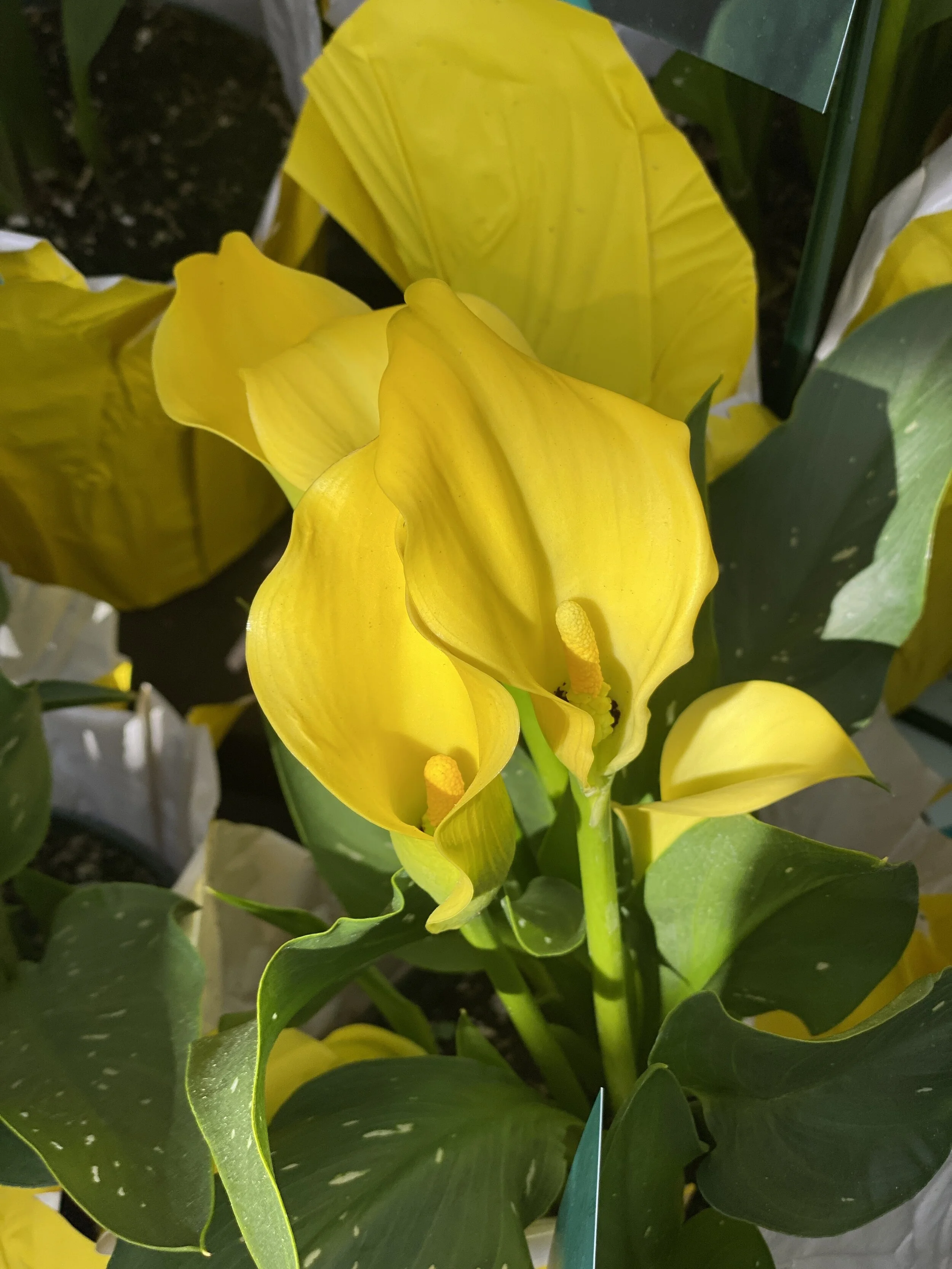
Right click + Save to download this subject photo
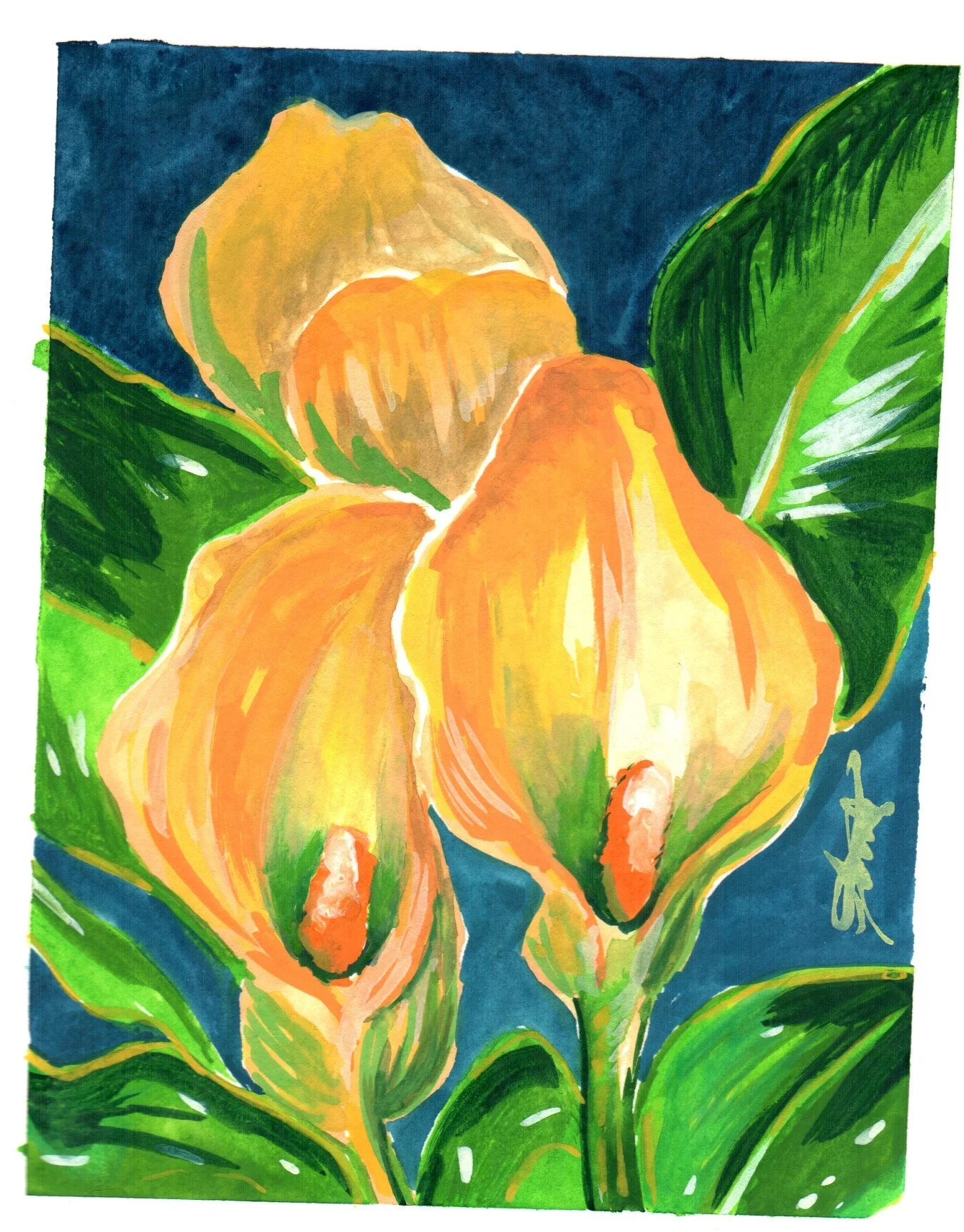
Impressionistic paintings begin like all other paintings, depending on the medium. With oil paintings, you sketch in the background with an underpainting. This is the traditional way to paint. With watercolors you block in areas of color and dive right into the glazing process where you layer color. However, with impressionism you build color with thick, imperfect strokes. Colors tend to be less blended together. Lines are not completely clean. Figures do not take shape perfectly. Instead, you are left with the “impression” of a subject. There are also degrees of how impressionistic a painting can be. Some are highly detailed. Others are splashes of color that take forms we can easily recognize.

See the example of Claude Monet’s landscape. He uses cool and light colors similar to other traditional painters, but large areas of color. He also uses rough brush strokes to achieve a mood, style, and movement in the piece. These techniques are commonly used in impressionism. The artists decision to add detail, smooth out the strokes, and make the piece more realistic, differentiate the work from other pieces indicative of realism. Although this example was painted using oils, the same style can be created with watercolors, gouache, and ink.

The second example is a Dutch realism painting intended to mimic a real still life setting. The Dutch were known for their beautiful realistic paintings and ability to render a still life setting perfectly. The themes of these paintings invoked philosophical questions and contemplation.
Stylisticially, in the image on the right, the colors are blended into smooth sections of color. Gradations of color show delicate shadows. The picture above does not show gradations of color, but instead uses rough brush strokes to achieve the same areas of shadow. With impressionistic painting, it was believed the most satisfying way to view the painting was from farther away. The farther from the painting you viewed it, the more realistic it would become to the viewer. Realism is intended to draw the viewer in. There is so much detail that you need to get closer to see all the small details.
Now that we have discussed the difference between impressionism and realism, we will tackle how to create your own impressionistic painting based off of a flower photo. You can pick any photograph of your choice, just make sure the picture has more than 2 colors, otherwise you will be selecting a third color for this tutorial.
Plan the colors
The first step in any painting process usually involves selecting colors for the painting. I decided to use the following:
Colors
Yellow Ochre, Naples Yellow, Raw Sienna
Prussian Blue
Permanent Green
Limiting your color palette will give you an advantage while painting. A lot of artists demonstrate the 3 color painting technique. This can create a striking composition, because limited palettes train your eye to paint with harmony. When you pick too many colors to paint with, it can lead to muddy colors, colors that conflict within the composition, and confusion when mixing. I recommend that you pick 3 main colors and begin mixing with them. I selected a yellow, a blue, and a green for this painting.
Sketch the shape
Defining the shapes in the composition will give you a head start. Often we dive right into the painting process without mapping out a plan. The purpose of defining the shapes is to prevent you from making them too small in the composition or too large. I have ruined a painting many times by not planning ahead, or conversely by painting outside of the lines I drew.
For this painting, I decided to draw the shapes with the gouache, rather than a pencil. I love sketching with color, because it forces my brain to think about the subject in more organic ways while at the same time considering line.
Fill in the basic shapes
At this point, you’ll want to consider the organic shape of the subject. I begin by blocking in areas with no white. It forces you to consider where the light source is hitting the object, as you pivot from thinking about lines, to thinking about shape. It’s a great way to practice having your mind go back and forth in considering line and shape. Often these exercises are separate.

Plan the background
Now that you have some basic shapes painted, you’ll want to consider the background. I look at this space as a white area that needs to be filled in. I’ll consider the original image and how busy it is. Sometimes I will take shapes or subjects from the original image and repeat them in spaces that feel empty. Composition is a great subject to practice. It will lead to overall better paintings that drive more interest in your work. If you’d like to learn more about composition, I have an article back at blog fundamentals.
Fill in areas in the composition that are empty
After you have filled in some areas with color and shapes, begin to think about complimentary colors for those shapes. I love blue and yellow, so I decided to map out the background with a rich blue. I thought this would make the main subject pop in color. You might decide on a light colored background depending on your subject. It’s all about composition and how you decide to frame the subject. Typically cool colors move backward, and warm colors push forward in the composition. That’s why you will typically see in a still life painting the background is a cooler color and the closest object to the front is a warmer color. I discuss this more in the still life projects and you can find them here.
Add detail
Here we are at the best part of the painting process and where it will begin to look impressionistic. Adding details to your painting will really make it feel finished, but you don’t want these details to be too clean, or too perfect. How I achieve a more impressionistic feeling to my paintings is by adding in highlights in areas where light is hitting the leaf.
I don’t completely smooth out my brush strokes. I don’t fill in every detail. I leave the petal colors looking less blended.
In my case, I added back in highlights on the leaves keeping in mind that the white wouldn’t truly be white, because I’m painting it over a darker color. Gouache activates the layer of paint below it. If you’re not careful, the colors will mix together and you won’t have a rich or true color as a result. Since this is the case, I let the painting dry more, and then I added in the white and yellow highlights.
I don’t always add highlights in at the end. Sometimes I will use masking effects to leave areas of white. Masking can really help you to keep your painting clean. I use washi tape because it’s very delicate and doesn’t tend to pull up the paper, but there are many different brands of artist tape. Masking fluid is a more common technique for watercolors, since the medium is so unpredictable. It’s a way to control the flow of color and prevent the areas you want to leave white from being painted over.
I hope you enjoyed the result of painting this impressionistic piece! For the full walk through, check out the video in real time on my YouTube channel.